
Contact Forms: 7 Pitfalls To Avoid
Forms are everywhere. You probably got a few on your site right now: A subscription form, contact form, login form, or a signup form.
Contact forms are a huge part of the web and are a great tool for increasing conversions. However, there is one big problem with a contact form.
More often than not, there’s just too much friction and it’ll scare visitors away.
You want to make your contact form as frictionless as possible. So, on that note, we’ve assembled 7 pitfalls to avoid when creating a contact form that’ll increase the contact form conversion rate.
Pitfall #1. Asking for Too Much
A common mistake is to ask for too much information in your contact form.
Research shows that the number of fields matter when looking at conversion rate. A company reduced their contact form from 11 to 4 fields, gaining a 120% conversion increase from 5.4% to 11.9%.
Another study done by HubSpot analyzing 40,000 contact forms found that reducing a form from four fields to three nearly doubled the conversion rate!
So, think about what are the most important pieces of information you need to know about your potential customers? And don't ask more than necessary. You'll scare them away.

Some websites make certain fields optional, giving visitors the choice whether to fill them in or not. This is not a good idea, though.
Many will not even notice it’s optional, so they’ll abandon your site because they think they need to fill out all of them.
The key to gathering leads is not to collect as much information about them as possible. It’s about making the contact process as simple as possible. So, make your form short and to the point.
Pitfall #2. Sound Like a Bot
A contact form doesn’t allow any real-time personal engagement. Considering that only 0,5% of people prefer communicating with bots over humans, it's important to make your form sound human.
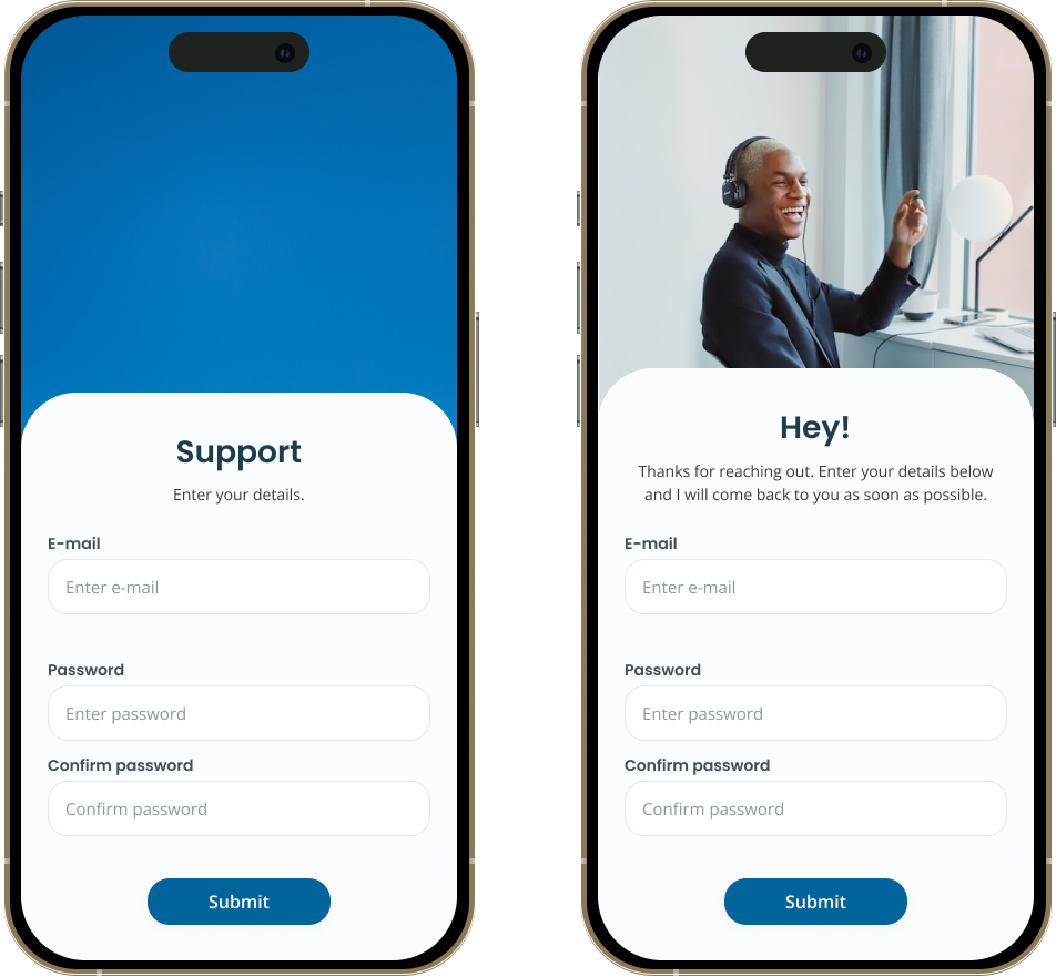
Give your form a conversational tone to make it clear that there’s a human on the other side. Write the form's copy as if you were having a conversation with the visitor. Use simple, everyday language.
Let’s take an example:
“The field is required”
or
“Oops, you’re missing this field”
See the difference?
You can also make your form human by placing an image of the people they are submitting their request to. Maybe it’s a specific sales representative or your customer service team?
The more human you make your contact form, the more likely you are to increase your engagement rate.
Pitfall #3. Response Time Not Clearly Defined
Waiting for something while not knowing how long you will wait can be an extremely frustrating experience. So, make it clear when you get back to the visitor.
Including a response time in a contact form shows that you respect and value the time of your visitors. A few hours? 24 hours?
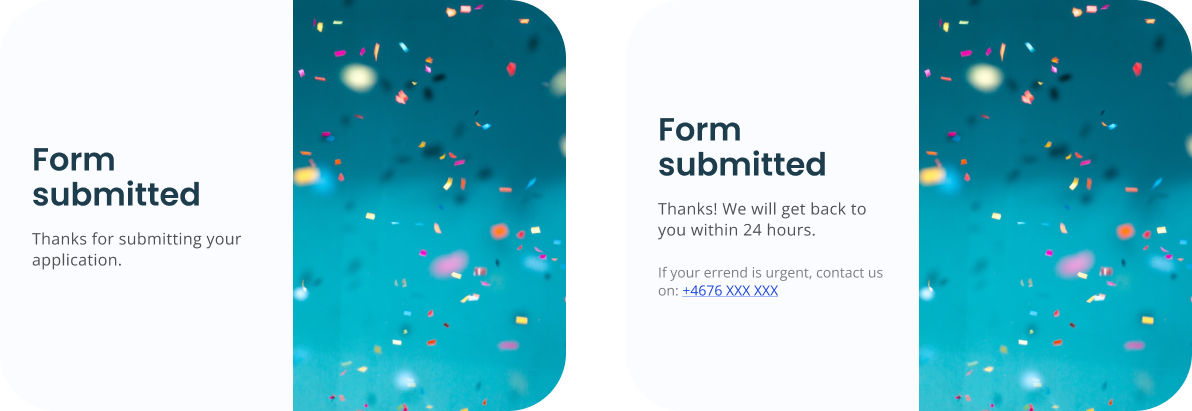
It demonstrates that you are committed to providing a good customer experience and it helps to build trust with users. Remember to include other ways to contact you, especially if your response time is long.
Tip!
To provide the fastest response time possible you may want to consider which e-mail your contact form inquiries are sent to. People who’ve just submitted your contact form are in a decision-making mindset, so maybe send them straight to a sales representative?
Pitfall #4. Unfit for Mobile Devices
It should be standard procedure today, but sometimes it gets overlooked.
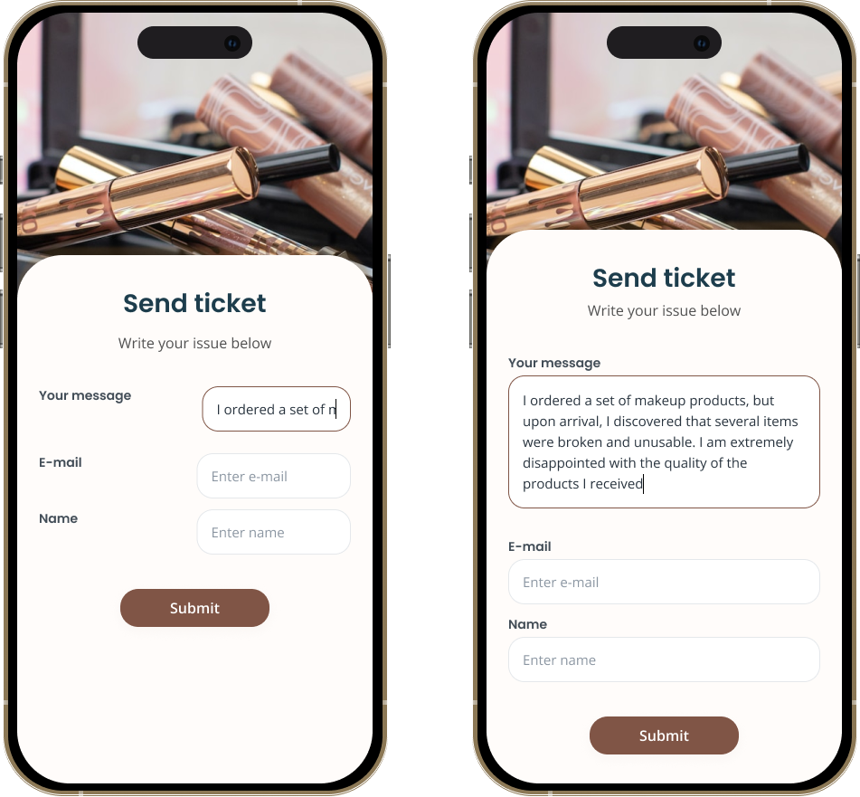
As more and more users access the internet on their smartphones and tablets, it is crucial that a contact form is designed to be responsive and easy to use on smaller screens. This ensures that users can easily fill out the form no matter what device they are using.
We also see the increasing usage of mobile devices vs desktop in our own data. In 2022, 61% of all chat inquiries are sent from a mobile, compared to only 25% in 2017.
If your contact form is not responsive, it will ruin the mobile experience and labels, or fields might get lost. Look at the example below. Not good, right?
Pitfall #5. Poor Design and Layout
If your contact form looks like it’s straight out of the 90s, it’s time to get creative!
Design plays a crucial role in the functionality and user experience of a contact form.
You want your contact form to be visually appealing and match your overall brand guidelines. You can make your form blend in by adjusting colors and fonts to match your brand.
A well-designed contact form is easy to understand and navigate, with clear labels and instructions for each field. You can even provide examples in each form field.
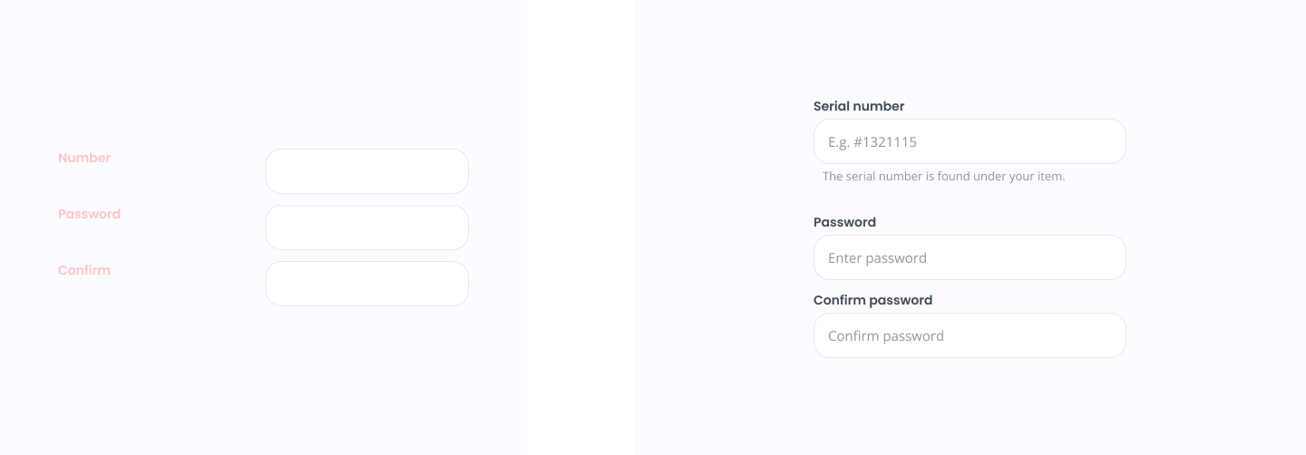
Where should your contact form be placed on the page? Left, or right?
A company changed location from left to right side and increased their conversion with 24.6%.
So, try to split test your design and layout and find what works best for you.
Pitfall #6. No Clear Call-to-Action
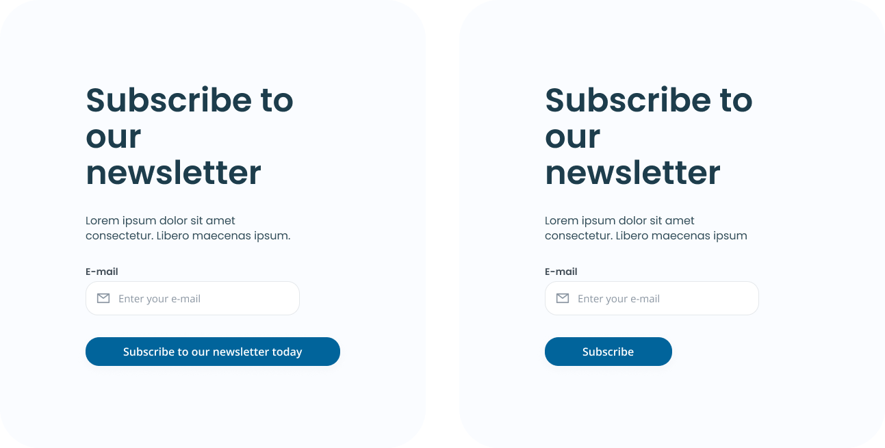
A user might fill out the contact form and not send it because they’re not encouraged to do so. Avoid this pitfall by making sure that your call-to-action is clear and prominent.
Visitors who fill out your contact form are ready to buy, so you must do anything you can to make them convert into leads.
Use action-oriented language to nudge the users to send the form. Research show that a CTA saying, “Click here” and “Go” convert 30% and 25% better than the default “Submit”.
However, “Download” and “Register” convert 15% and 10% worse.
Tip!
If you have any doubts about the effectiveness of your CTA, then A/B test it against another one. Set up a new version of your landing page with a different CTA and then send traffic to both versions.
Pitfall #7. Not Giving Confirmation
“Did it go through?”. Is not what you want your users to think! A big mistake to make is to not make it clear that the user’s message has been received.
A confirmation message acknowledges to the user that their message is being processed.
This can provide reassurance and a sense of comfort to the user that their message has not been lost or forgotten. Saying “Thank you” is a simple but effective way to provide a better user experience.
If a user is not sure if the form has been submitted successfully, they may try to submit it again, which can lead to multiple, duplicate submission. A confirmation message can eliminate this confusion and improve the overall user experience.
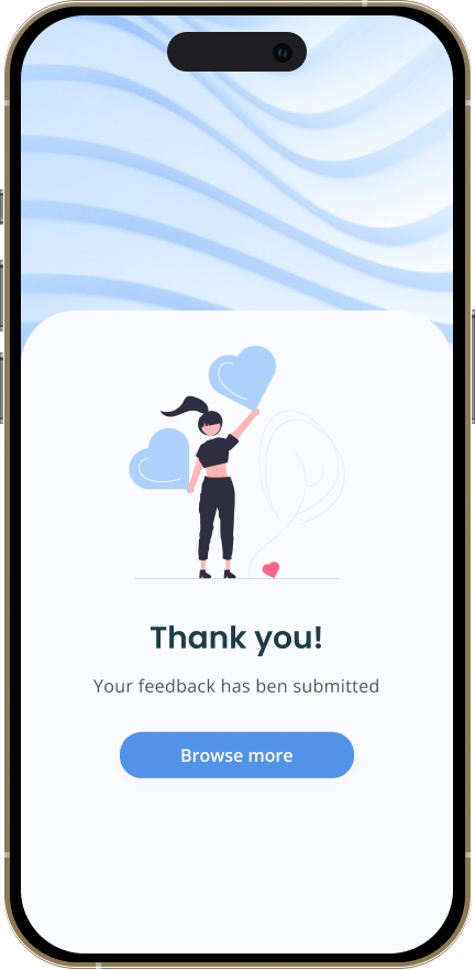
Also, take this opportunity to direct users to another relevant page on the website after the contact attempt was made successfully. This will increase engagement as you’re inviting them to continue to stay on your website.
Wrapping Up
The more friction you can eliminate from the user experience, the higher you’ll be able to push your conversion rate.
Creating a contact form for your website can seem like a simple task, but it's important to consider all the potential pitfalls to ensure that it is user-friendly and effective.
By avoiding these 7 mistakes outlined above, you can create a contact form that is easy to use and that effectively connects visitors with your business.
